

Dev Panel Interface
The Dev panel is accessible by clicking on the 👁 icon in the top right of your window. Once opened, it presents all the tools necessary for creating your application pages.
Toolbar

Keeps the Dev Panel permanently open. Without pinning, the panel automatically retracts and only displays when hovering over this icon.

Defines the display mode of the Dev Panel. Unlocked: the panel displays as an overlay on top of the page. Locked: the panel reserves a dedicated space and the page resizes alongside it.

Activates a visual debugging mode that draws dotted borders around all page elements, including normally invisible empty containers. Useful for identifying the DOM structure.

Enables/disables the forced display of all conditional elements. Enabled: normally hidden blocks become visible with a hatched background to distinguish them from always-displayed elements.

Redirects to the application's global administration interface for managing projects, users, and system settings.

Undoes or redoes the latest structural and content modifications (adding/removing elements, movements, property changes).
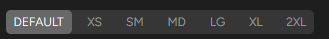
Responsive breakpoint selector
Responsive design allows adapting a website's display according to the screen size of the device being used. Breakpoints define the width thresholds where the layout must adapt (smartphone, tablet, desktop)
Default: Default settings applied to all screen sizes without specification
XS: Extra Small - Very small screens (0px and up)
SM: Small - Small screens (from 640px)
MD: Medium - Medium screens (from 768px)
LG: Large - Large screens (from 1024px)
XL: Extra Large - Very large screens (from 1280px)
2XL: 2X Large - Ultra-large screens (from 1536px)
How it works:
The selected breakpoint serves two functions:
Example: By selecting "SM", the preview resizes to the width of small screens. A 10px padding defined on a container will apply to SM and larger screens (MD, LG, XL, 2XL), unless these breakpoints have their own defined values.
ℹ️ Info : When style parameters are defined on a specific breakpoint, the corresponding icon will be underlined to indicate that it contains custom styles.